
Freedom Hygiene
Texas State University | Brand Design. Package Design.
Problem
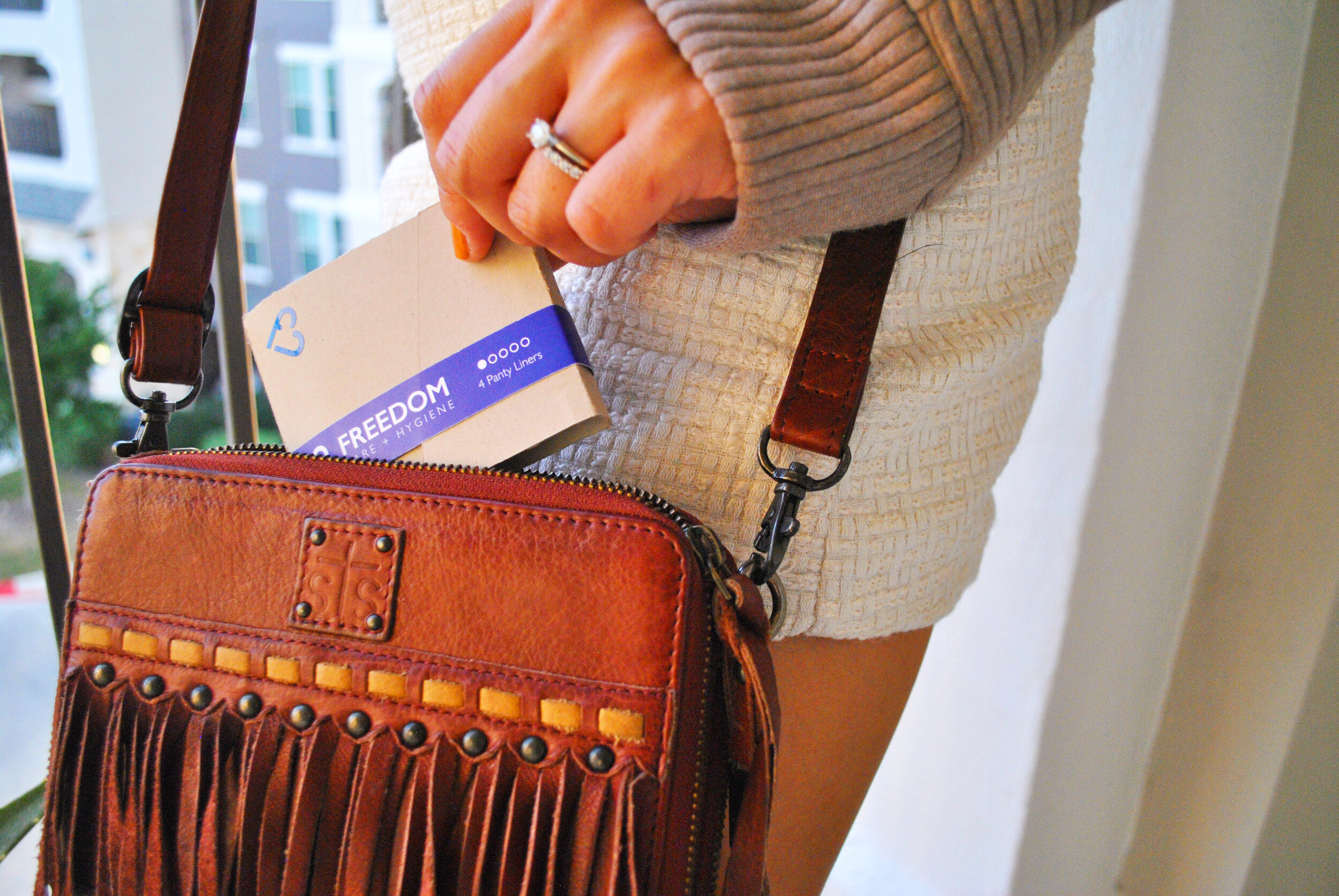
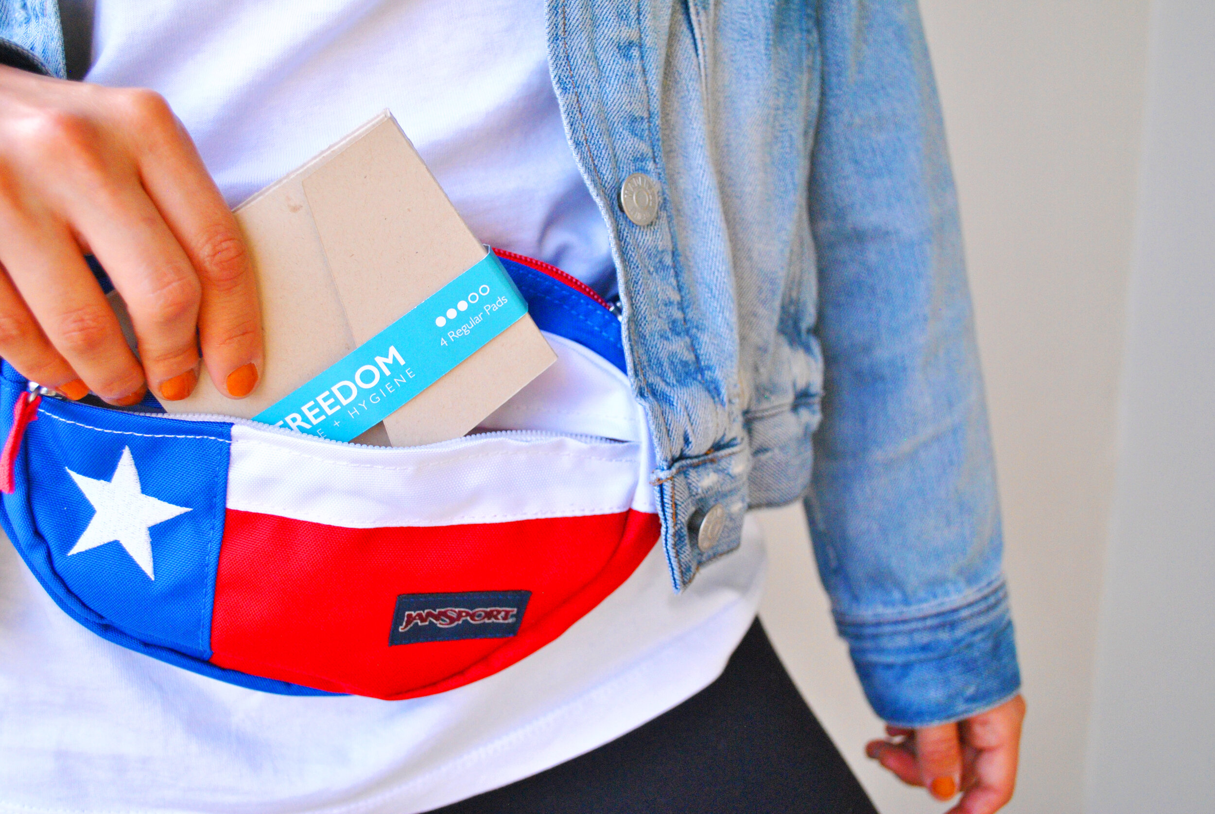
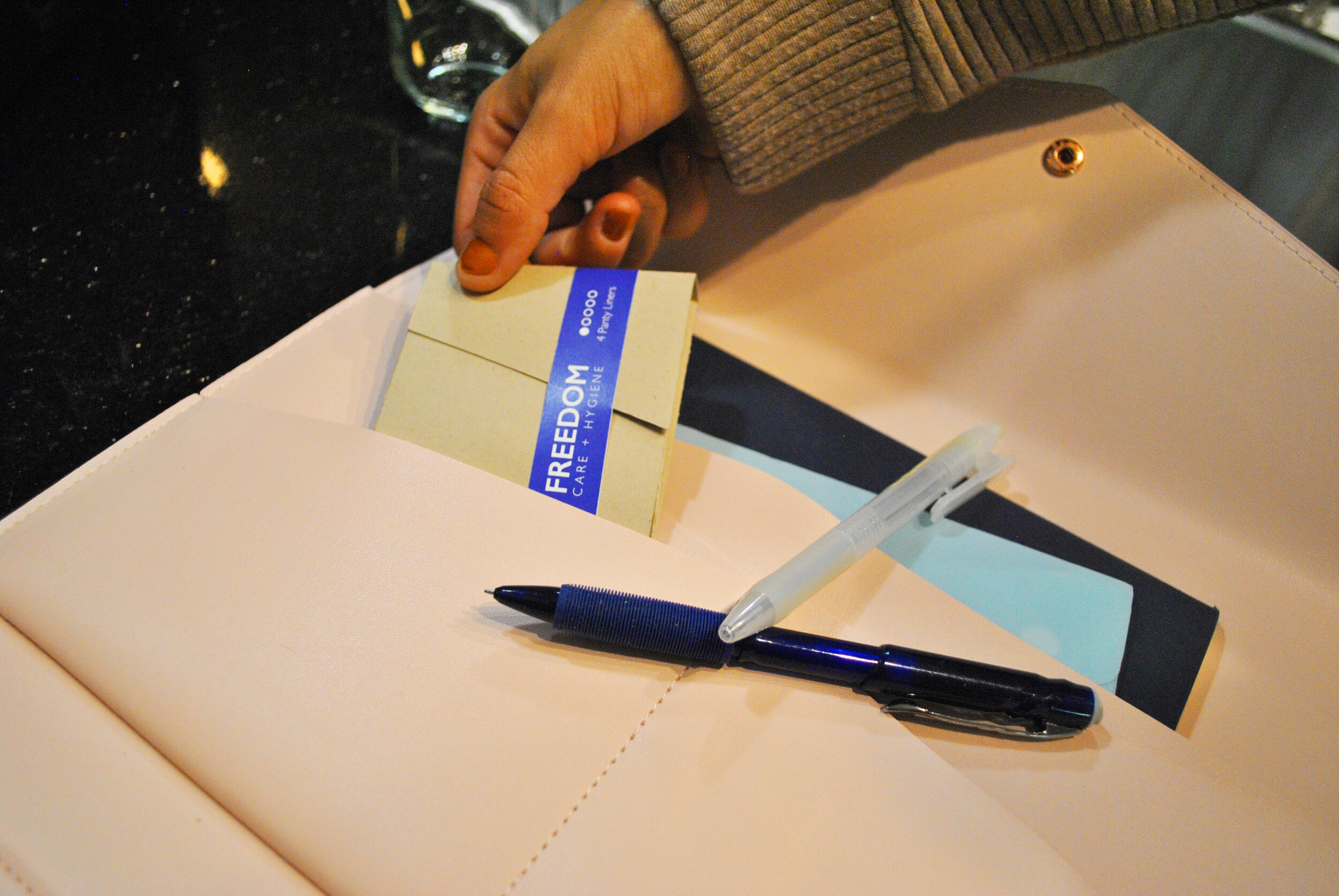
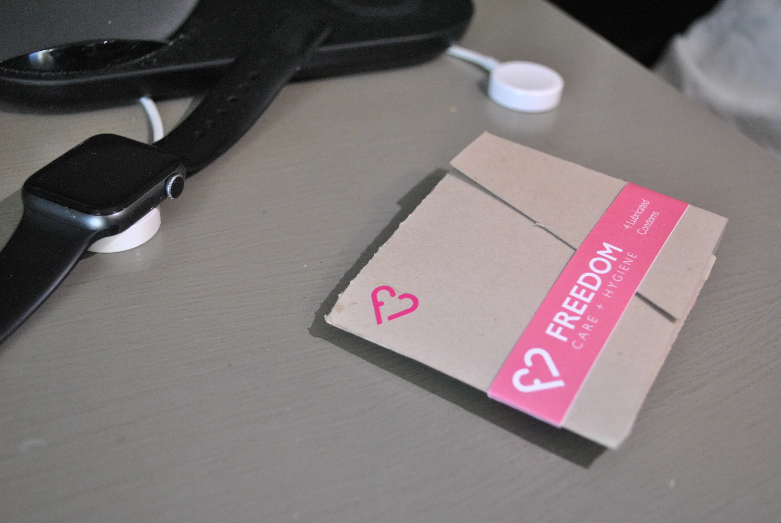
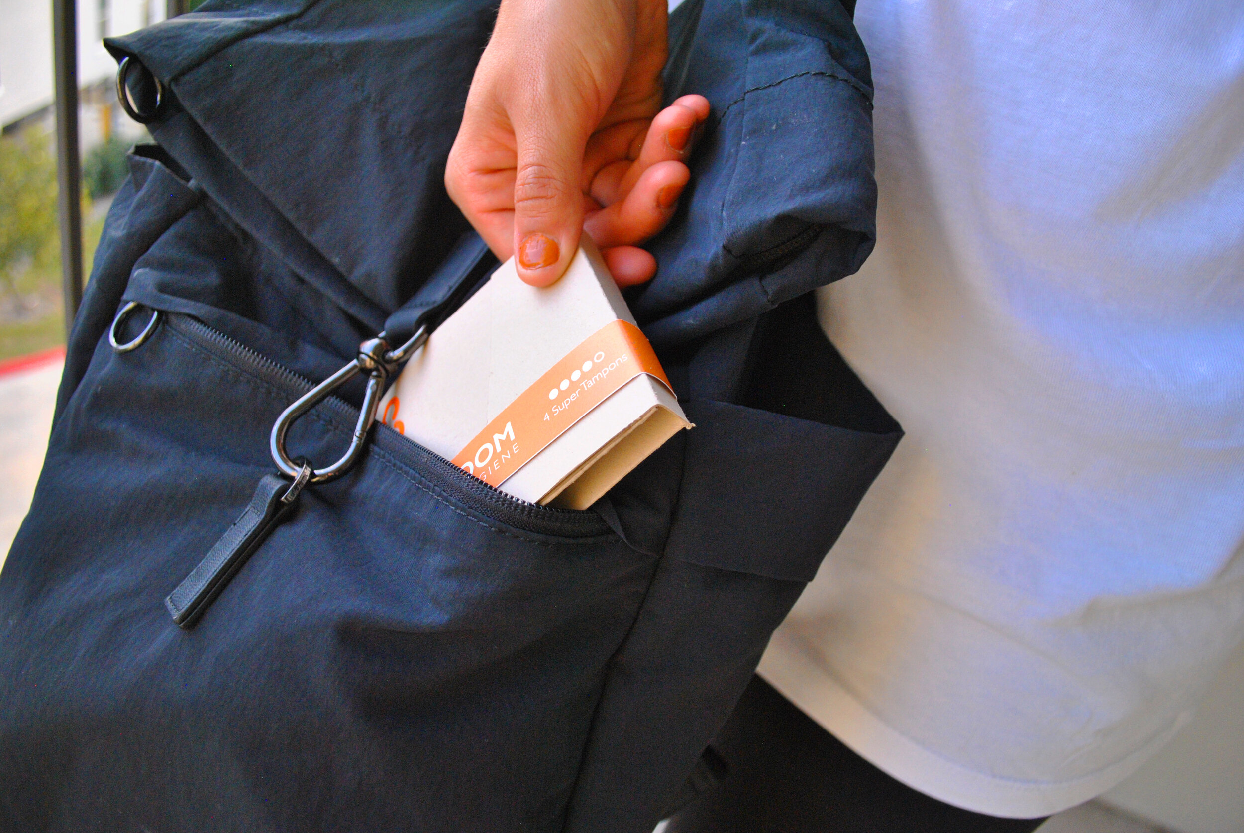
Condom and hygiene packaging has not changed much over time. It has been a simple box that many users are embarrassed to bring up to the checkout lane or carry around. Once hygiene and sexual health products are purchased they are never taken care of properly. They are thrown in the bottom of purses, forgotten, or lost and never there when you need it.
Morphological Approach
Approach
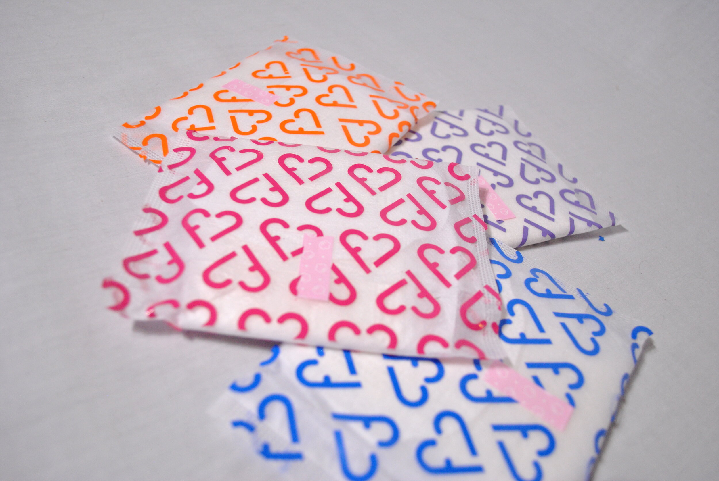
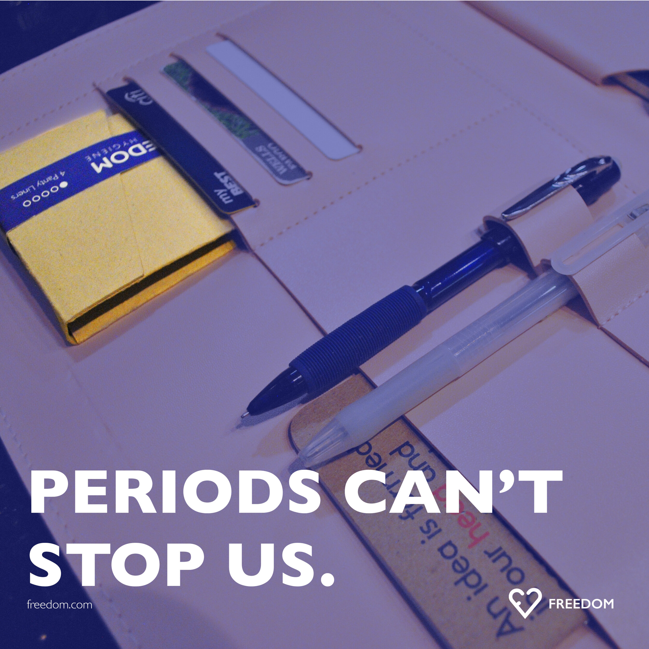
Freedom Care + Hygiene is a company with the main goal of empowering women to take control of their sexuality. With Freedom, they have the ability to be prepared for any situation (both expected and planned or unexpected). Freedom strives to eliminate problems and stigmas around sexual health by creating packaging that is visually appealing while also a tad discrete.
Trademark
Applications
Color
Typography
Competitive Brand Audit
Prototypes
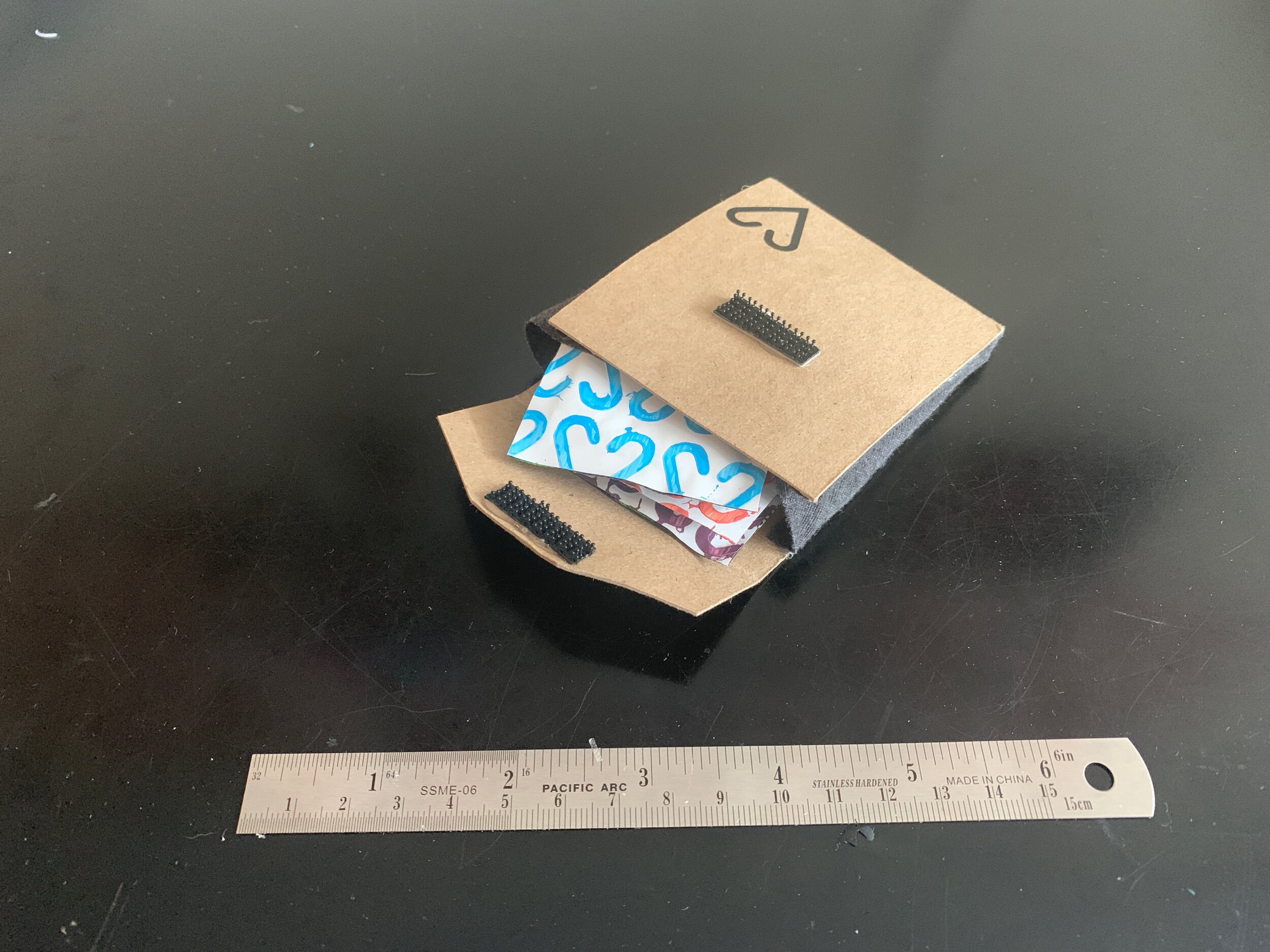
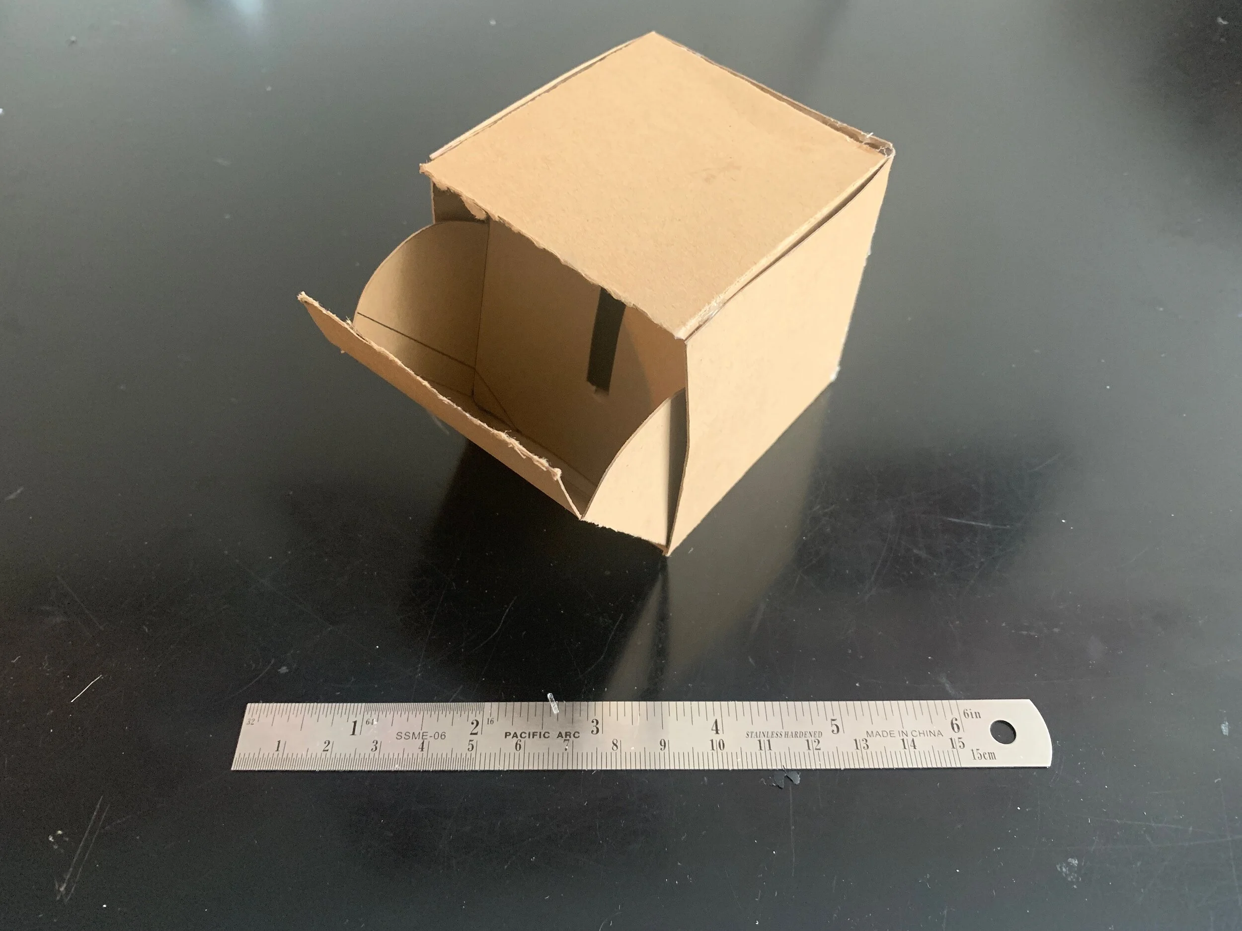
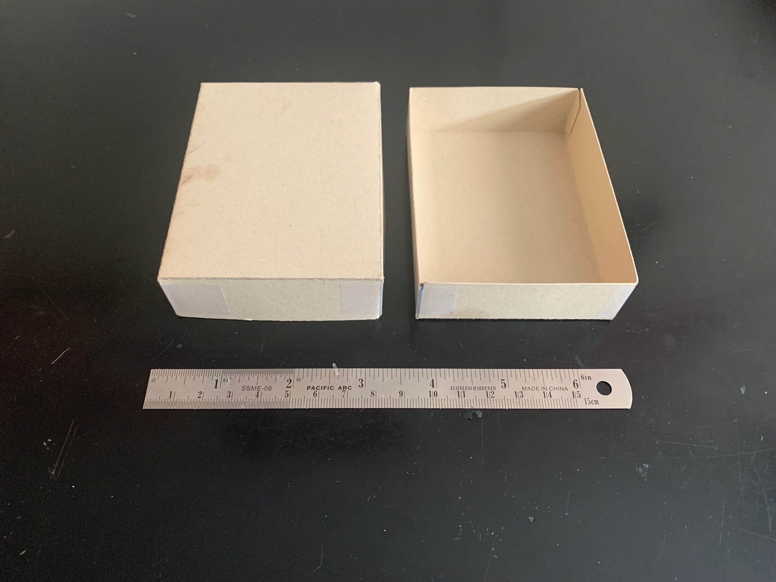
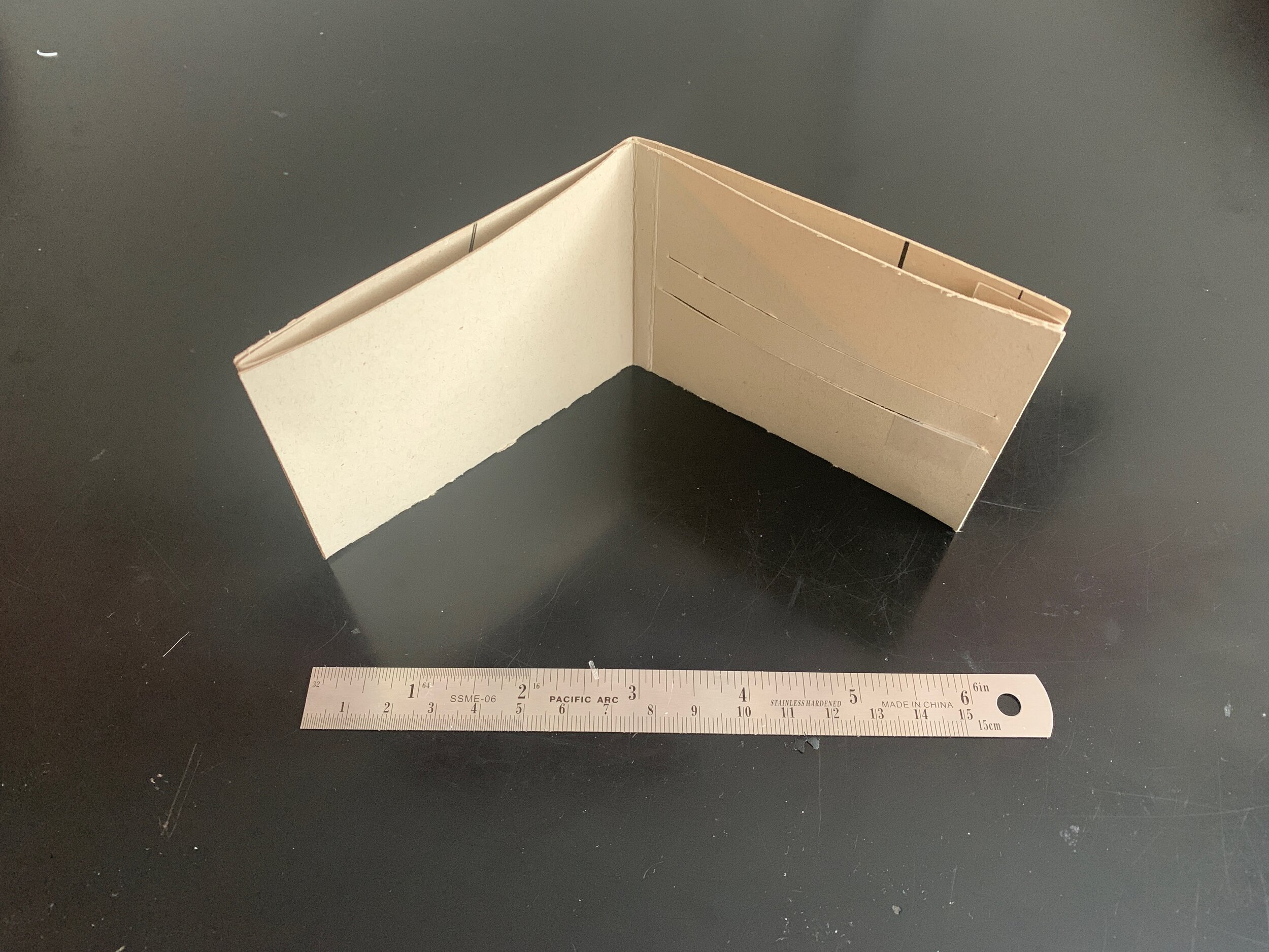
Dieline
Brand Voice







Further Investigation
To expand Freedom, I would want to develop a bigger package that could be utilized at home and hold more product. I would also like to expand the ephemera offered so that they could have freebies to get brand awareness out. Ephemera would include t-shirts, stickers, or even small totes. These could be distributed at different kiosks at grocery stores, on college campuses, and in even different mail marketing packets.


