Socktopus
Texas State University | Typography. UX/UI.
Problem
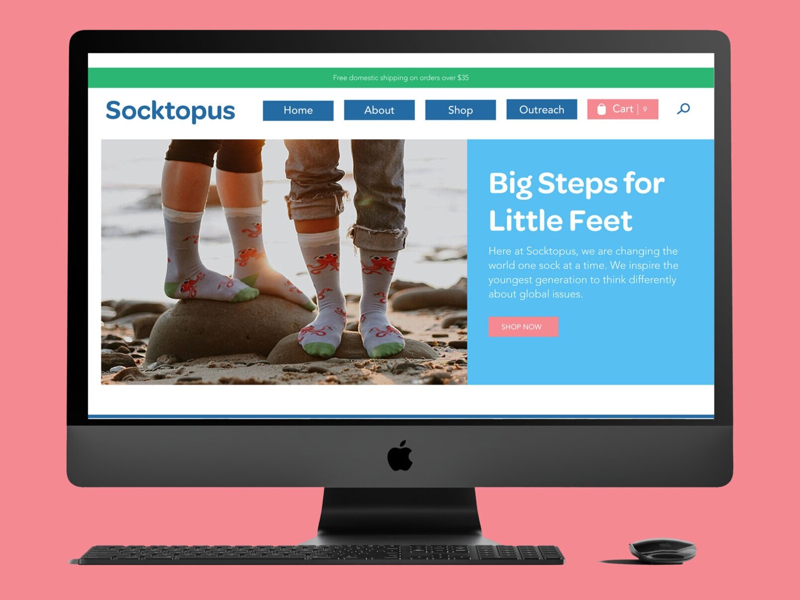
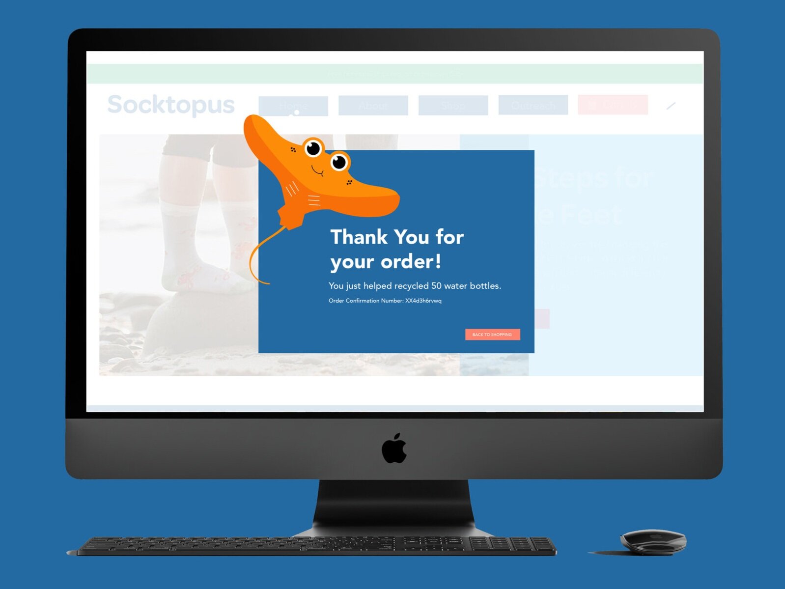
Socktopus is a sock company that manufactures their products solely from recycled water bottles. But while their product is innovative, their website and brand are not appealing or user friendly. With their recent launch after Kickstarter, they need a fresh look to give a professional feel to users. Socktopus also needs an effective way to tell their story of the recycled products since that is such a key component of their brand.
Persona- Brittney Davis
Approach
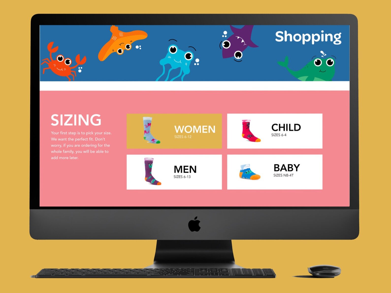
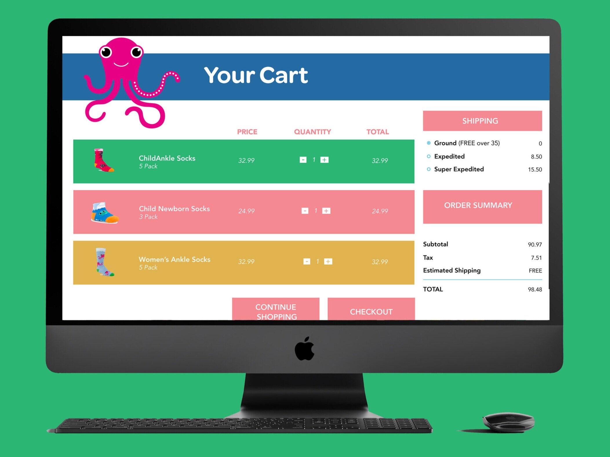
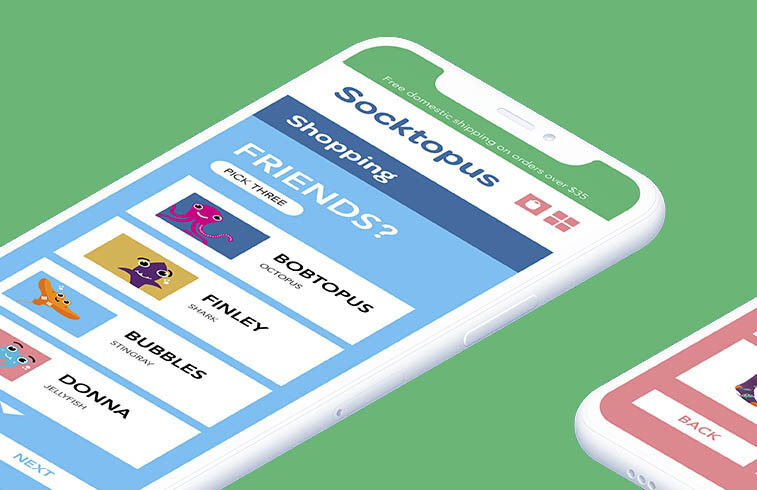
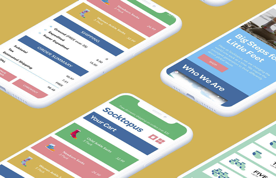
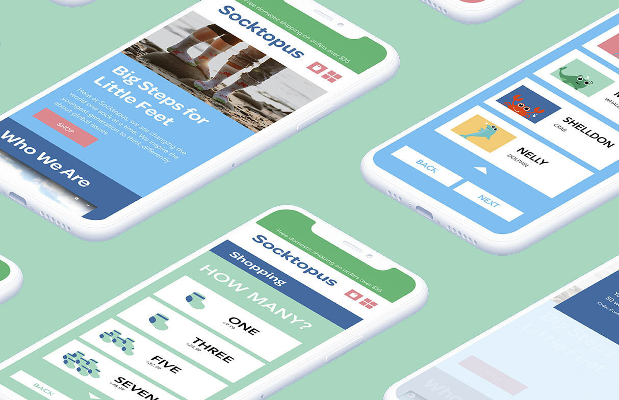
The approach was to give an ocean vibe while staying kid friendly, fun, and colorful. The rebrand also needed to showcase their cartoon sea creatures in a fun manner. With their many varieties and sizes, Socktopus also needed a way for users to easily find what they are looking for. The goal was to make it easy to shop for the whole family.
UX/ UI Do and Don’ts
Trademark
Applications
Color Palette
Typography
Brand Voice
Competitive Brand Audit
Further Investigation
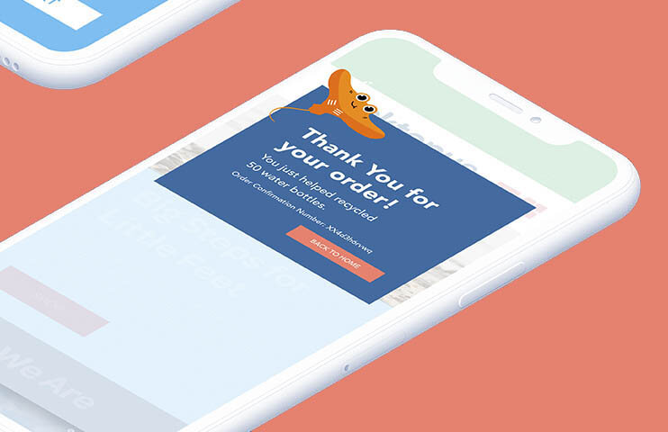
In the future, I would like to design and produce more ephemera and products to expand their brand. With Socktopus’ family of sea creatures, there are so many opportunities for an entire line of products to promote cleaning and maintaining our oceans. This would include coloring books, tshirts, stickers, books, and games. With Socktopus’ growing brand, an app design would also help to keep buyers in the loop and provide easy access.
